Problem Enterprise customers lack actionable and reliable insights on what their teams are working on because users hate logging time.
Opportunity: Capacity Insights presented an opportunity for Tempo to expand beyond time tracking into strategic planning by addressing a key customer pain point: understanding team capacity across multiple projects and timeframes. As organizations scaled agile practices, they needed clearer visibility into future availability to plan work more effectively. By introducing AI-driven insights, Tempo could differentiate its product suite, deepen engagement with existing customers, and open new revenue streams in the strategic portfolio management space.
My Role: At Tempo, I led design for Capacity Insights, a 0–1 product that aimed to help teams forecast availability using AI-generated insights. I worked closely with PMs and engineers to define core use cases, translate complex capacity data into actionable visualizations, and explore automation opportunities for agile planning. My role spanned from early discovery through prototyping and usability testing to support an iterative build-measure-learn cycle.
How might we help teams anticipate and plan their future availability more effectively through AI-powered capacity insights, so they can make smarter, faster resourcing decisions?
Problem Enterprise users hate logging time manually because it’s time-consuming, leading to low task efficiency and user drop-off.
Opportunity: To reimagine time tracking as a low-effort, high-accuracy experience by combining user-controlled automation with ML. By leveraging data from different systems, we could reduce manual input, improve data reliability, and rebuild trust —while meeting the needs of both individual users and enterprise administrators. This would help Tempo expand in the Enterprise space.
My Role: I led end-to-end design for Tempo’s automated time tracking feature. Interviews with enterprise users revealed that they were frustrated with spending 30+ mins a week manually logging time. This created an opportunity for a UX strategy that would reduce user pain through automated time tracking. I pushed to improve our ML algo to recognize common patterns, making time tracking faster and smarter at scale (among other things).
How might we use integrations for automated time tracking to reduce user friction, increase efficiency and increase trial-to-paid conversion?
Problem Enterprise customers lack actionable and reliable insights on what their teams are working on because users hate logging time.
Opportunity: Capacity Insights presented an opportunity for Tempo to expand beyond time tracking into strategic planning by addressing a key customer pain point: understanding team capacity across multiple projects and timeframes. As organizations scaled agile practices, they needed clearer visibility into future availability to plan work more effectively. By introducing AI-driven insights, Tempo could differentiate its product suite, deepen engagement with existing customers, and open new revenue streams in the strategic portfolio management space.
My Role: At Tempo, I led design for Capacity Insights, a 0–1 product that aimed to help teams forecast availability using AI-generated insights. I worked closely with PMs and engineers to define core use cases, translate complex capacity data into actionable visualizations, and explore automation opportunities for agile planning. My role spanned from early discovery through prototyping and usability testing to support an iterative build-measure-learn cycle.
How might we help teams anticipate and plan their future availability more effectively through AI-powered capacity insights, so they can make smarter, faster resourcing decisions?
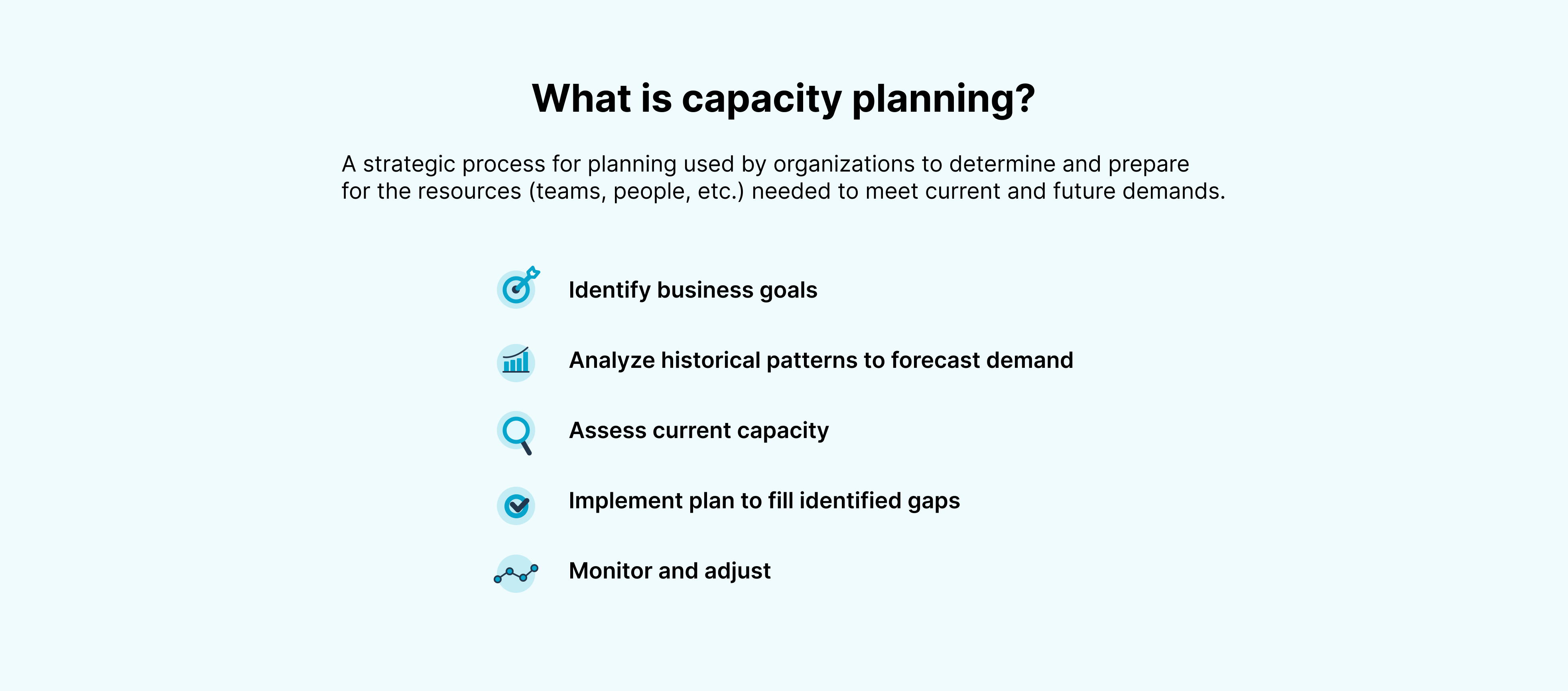
Objectives 🎯
Overview
Enterprise customers struggle with accurately assessing workload distribution and capacity for their agile teams, leading to inefficiencies and missed deadlines.
Tempo’s AI-powered Timesheets along with Tempo’s Capacity Planner’s capacity planning solution provided enterprise customers with a solution to their struggles with workload distribution and increased the efficiency of logging time in timesheets through AI recommendations/suggestions.
Following the success of these solutions, we talked to customers and forged a path at the intersection of the two solutions, with a focus on agile teams. Capacity Insights aimed to solve the problem of inefficiencies and missed deadlines by providing actionable insights into team capacity.
Strategy
Disrupting the engineering capacity management market with a net new product in the Atlassian marketplace that leverages AI.
Providing data-driven actionable insights to managers in the Software development space.
Increase in enterprise customers by solving for their pain points.
integrations ↔️
Leverage Integrations
We decided to leverage Timesheets by Tempo’s integrations to help users get a better picture of the work they did thanks to integrations with Google Calendar, Office 3655, Github and VS Code (to name a few).
In order to tackle a major pain point that was identified from enterprise customers, we released organization-level integrations, where an admin can enable integrations for the entire organization or specific Tempo Teams that they choose.
This reduced the burden for individual contributors as they no longer have to manually go in and enable each integration in their instance.
Onboarding Collaboration with growth🙌🏽
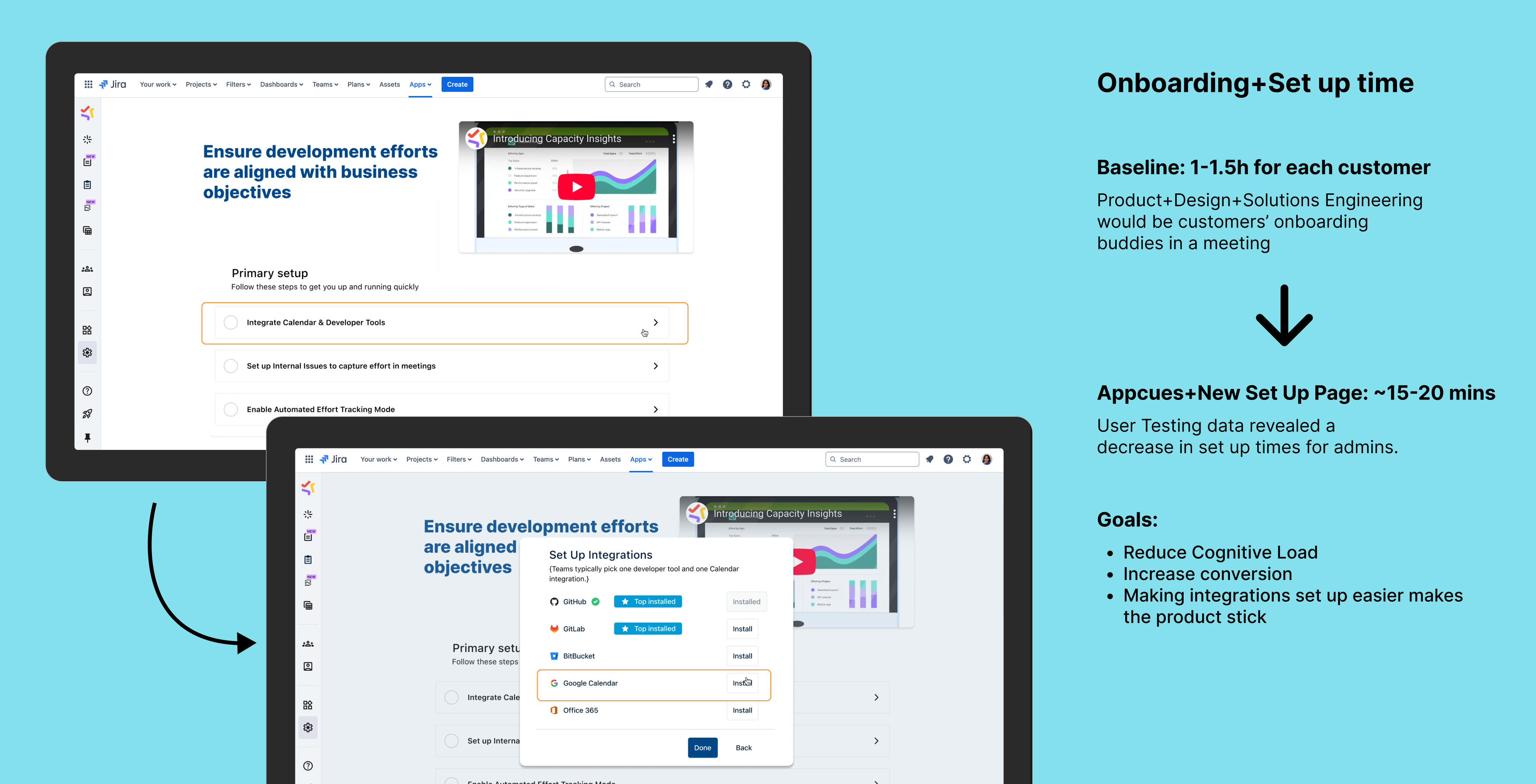
Reducing Time to Value (TTV)
I collaborated with the Growth team to build the onboarding flow together and created a strategy for the onboarding process for the product. This included mapping out which part of the flow will use Appcues, which will have in-product touchpoints, etc. It was a very fun learning experience.
iterative design 🔄
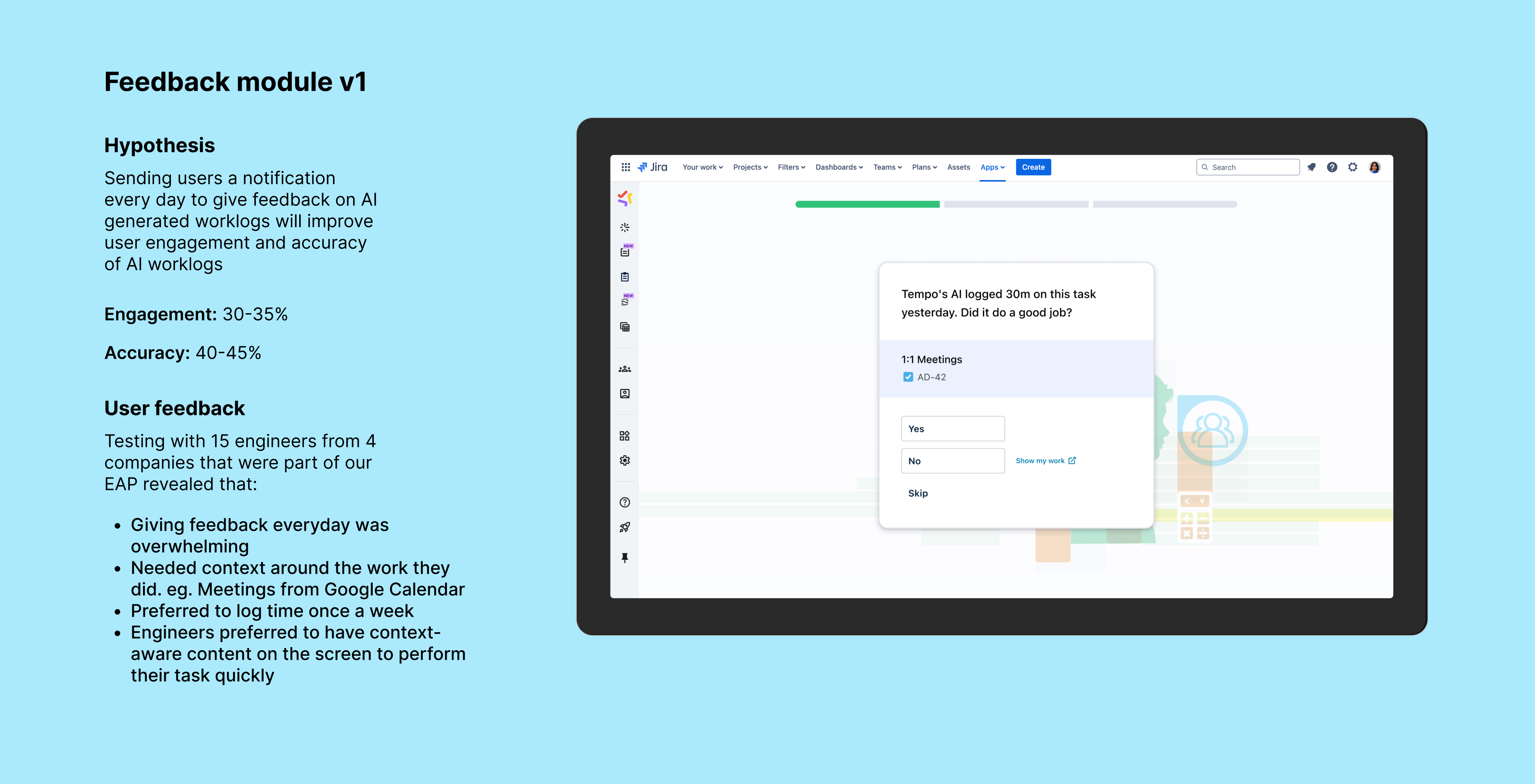
Feedback module to increase AI work entry accuracy
Giving AI summaries of dashboard data is the next step in Capacity Insights’ journey. Atlassian’s introduction of Rovo meant that we had to take into account whether we wanted to leverage Rovo or create our own AI summaries from scratch. This is still up in the air. However, we already have some usability testing data for existing dashboards along with a concept for Rovo integration. Customers are very keen on seeing Rovo in the Tempo suite.
Future 🔮
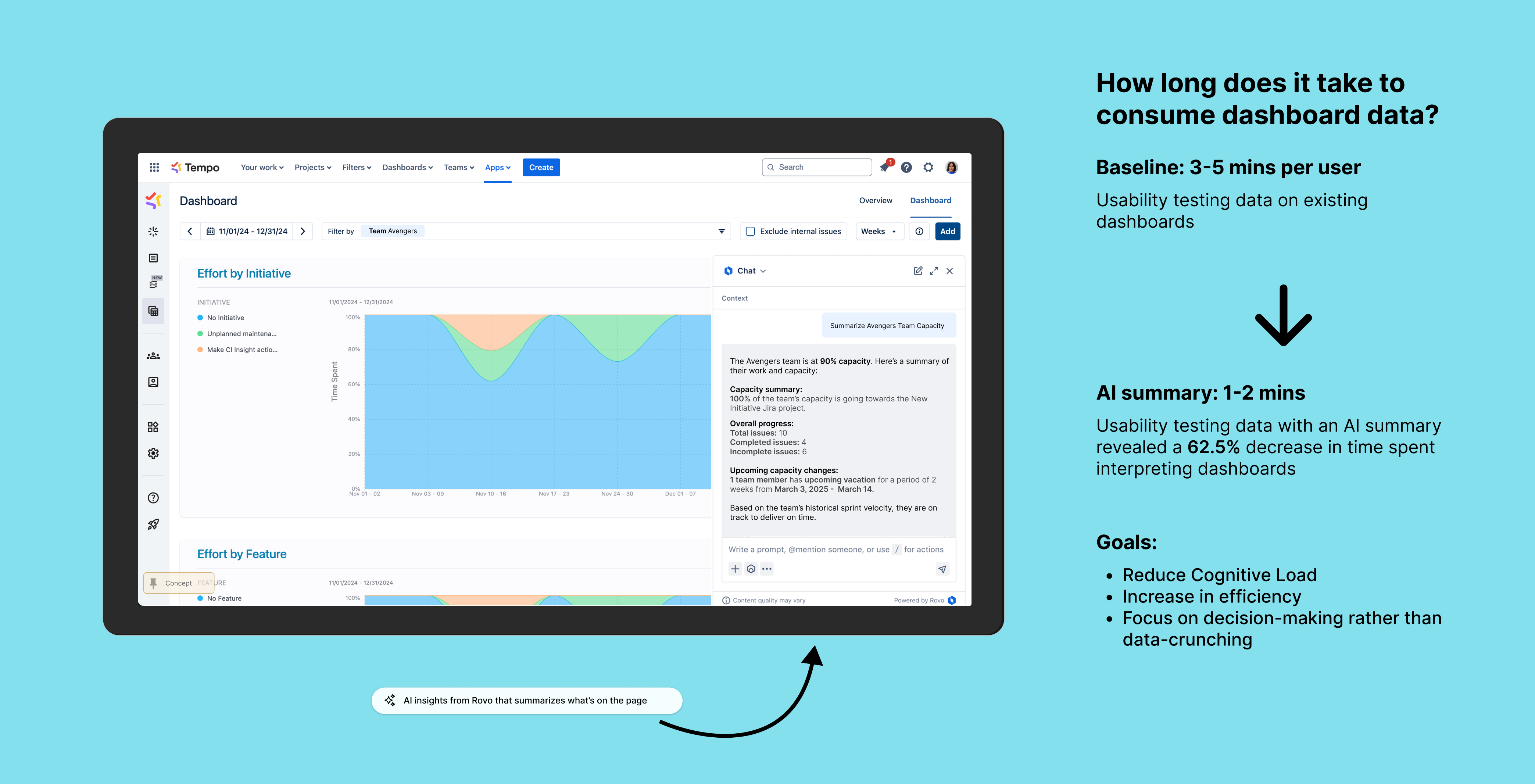
AI summary using Rovo
Giving AI summaries of dashboard data could be the next step in Capacity Insights’ journey. Atlassian’s introduction of Rovo meant that we had to take into account whether we wanted to leverage Rovo or create our own AI summaries from scratch. This is still up in the air. Customers are very keen on seeing Rovo in the Tempo suite.
Learnings and reflections 💬
Shaping the big picture
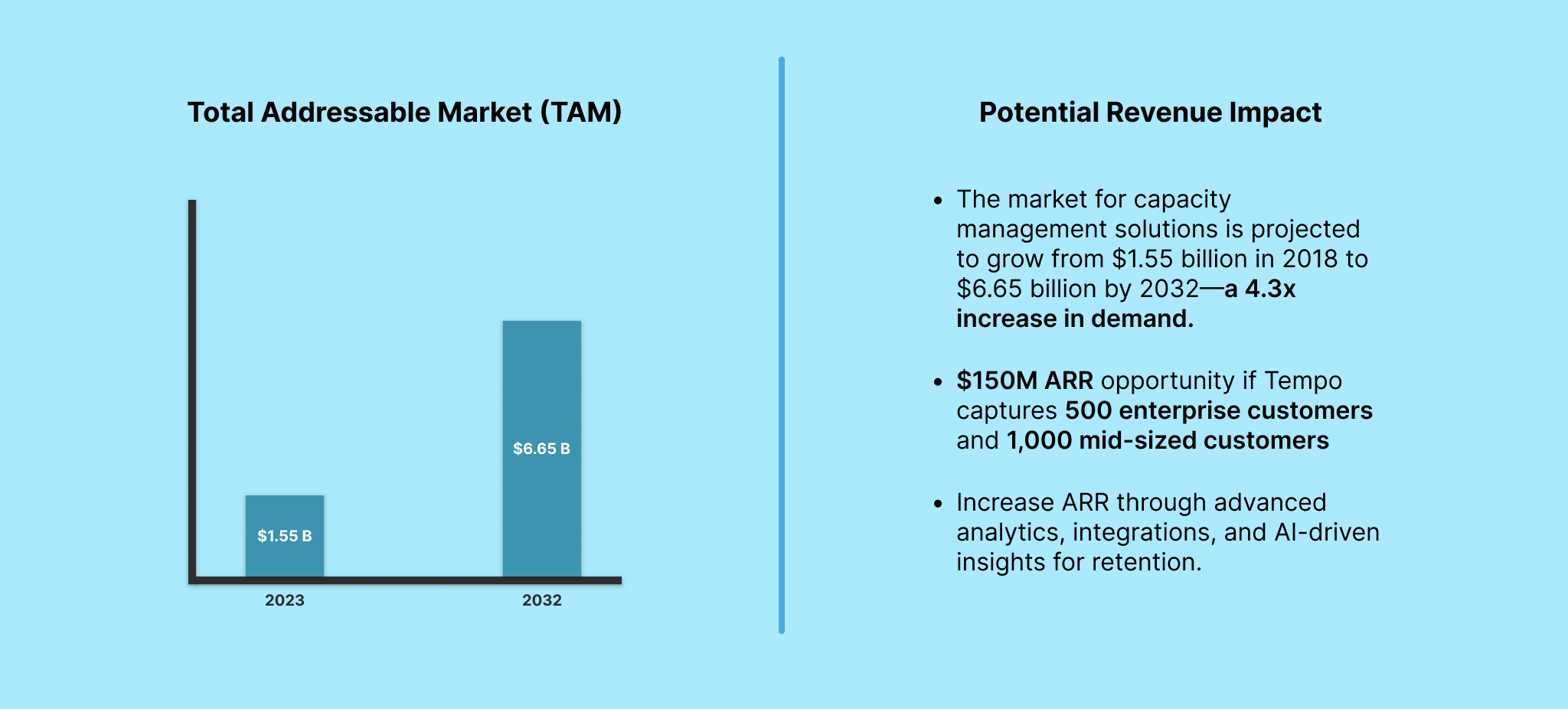
Collaborating with various teams across the organization as well as engaging with stakeholders at the C-Suite level to find product-market fit helped me look at design from a different lens. I studied and learned about a lot of business related things like the difference between Total Addressable Market (TAM), Serviceable Available Market (SAM), and Serviceable Obtainable Market (SOW) as well as how they contributed to calculating Projected Revenue. All of this informed my design strategy and decisions.
How might we help artists find meaningful and sustainable work that is accessible?
Overview
Connected Dots is an innovative platform designed to foster meaningful connections within communities by bridging individuals and organizations with shared goals. As the lead product designer, I was responsible for shaping the platform from concept to MVP. This project required a deep understanding of user needs, accessibility, and stakeholder alignment, culminating in securing a million-dollar grant to bring the vision to life.
Understanding the needs of both end-users and organizational stakeholders was critical to shaping the vision and design of Connected Dots. We employed a dual approach of user interviews and stakeholder consultation meetings to ensure the platform aligned with user needs and Tirgan’s strategic goals.
User Interviews
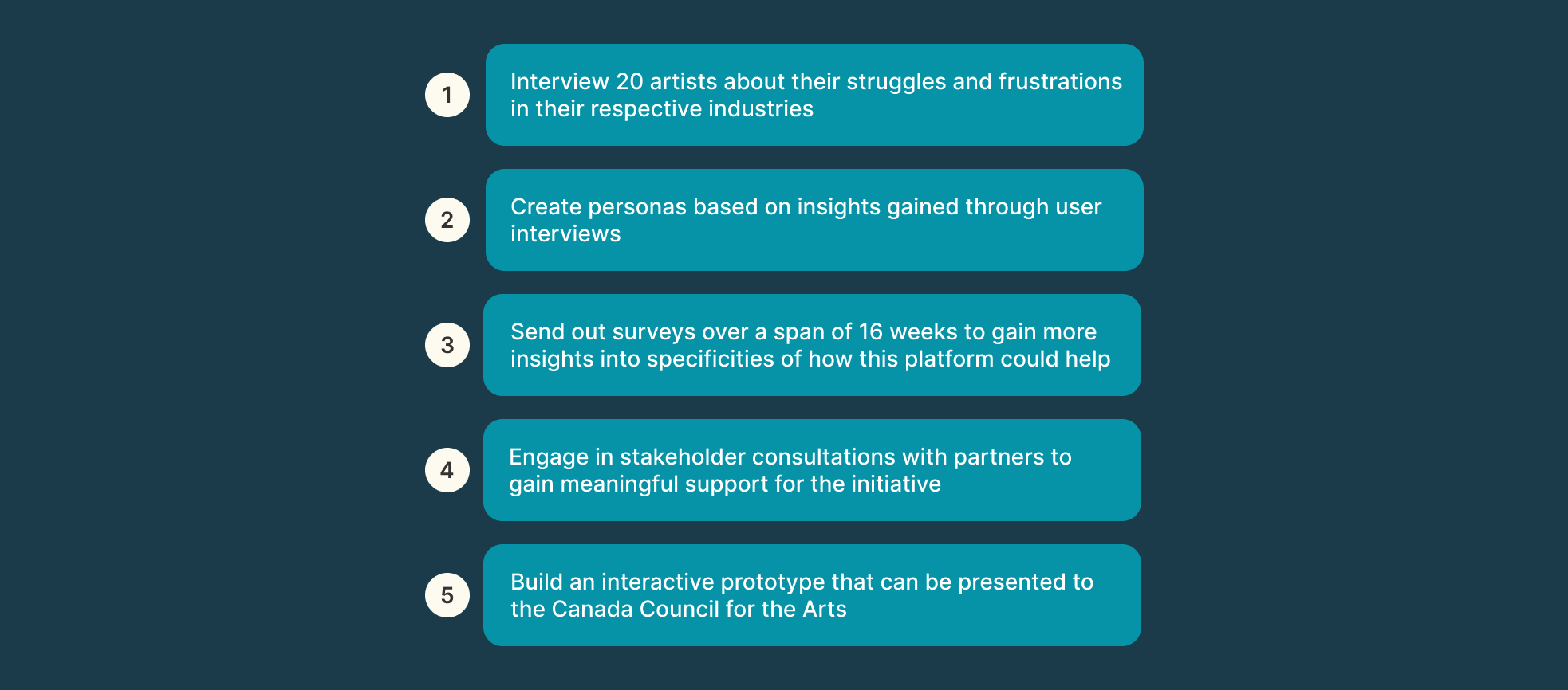
To gain insights into the challenges and expectations of potential users, we conducted interviews with individuals across diverse backgrounds, including community organizers, artists, and individuals with disabilities.
Key Findings:
Users wanted a platform that could facilitate meaningful connections without overwhelming them with unnecessary features.
Accessibility emerged as a priority, with participants highlighting the need for visual cues, text-based alternatives, and customizable notification systems.
Many users expressed a desire for streamlined workflows to manage events and collaborations effectively.
Impact on Design:
These insights shaped features like the simplified onboarding process, an intuitive dashboard, and the integration of accessibility-first design principles.
Stakeholder Consultation Meetings
We held recurring workshops and meetings with Tirgan’s leadership and grant writers to align the platform’s vision with organizational objectives.
Key Focus Areas:
Defining the core mission of Connected Dots as a bridge between communities and individuals.
Prioritizing features that would deliver the highest value in the MVP, such as event management tools and user connection workflows.
Ensuring the platform’s design would resonate with grant evaluators, emphasizing both impact and feasibility.
Collaborative Decision-Making:
Stakeholders provided valuable feedback on the platform’s roadmap, helping us balance user-centric design with business objectives.
By combining user insights with stakeholder guidance, we created a platform prototype that was not only functional and inclusive but also aligned with Tirgan’s mission to foster community connections.
Finding our path
The Lay of the Land
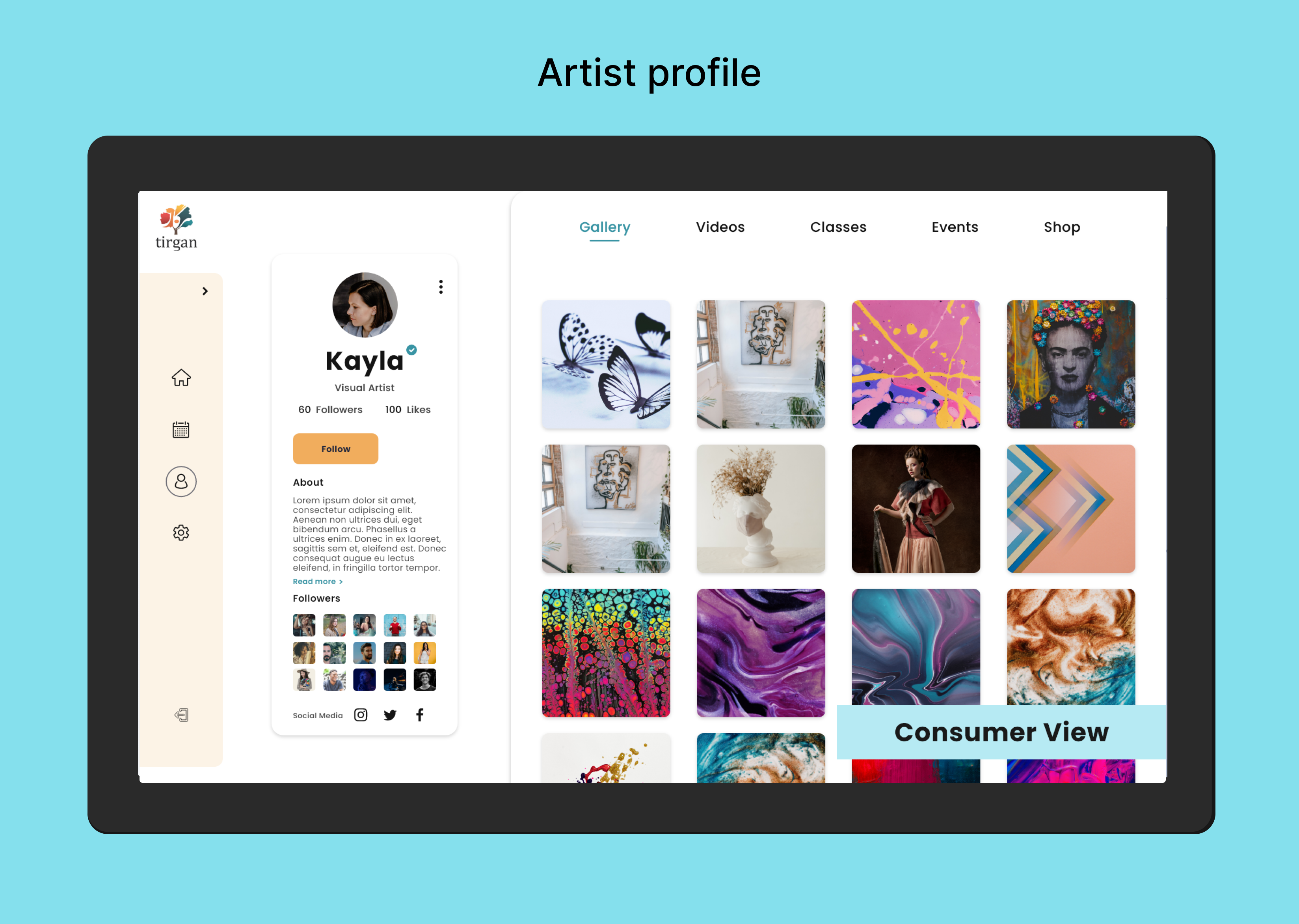
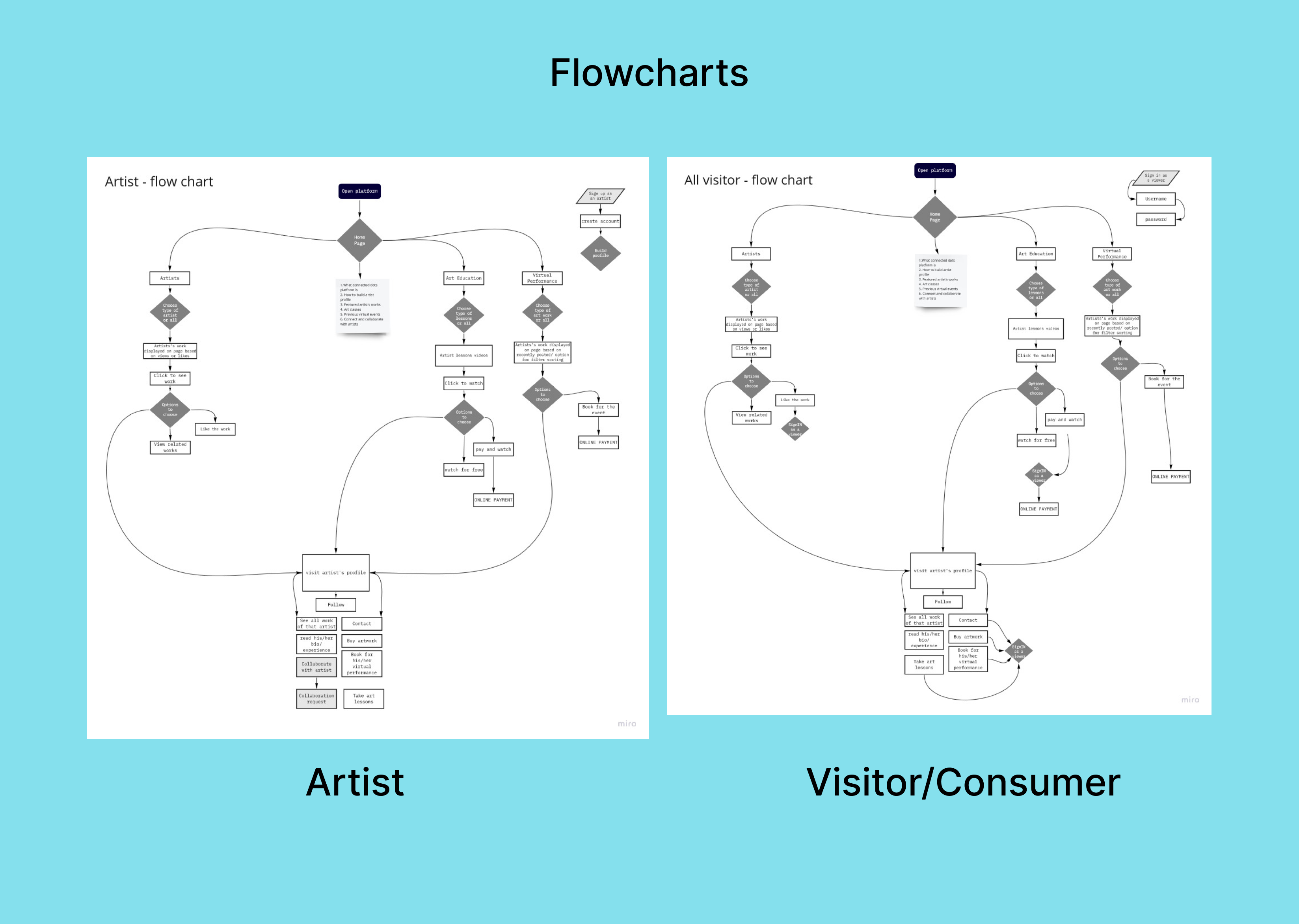
We worked on mapping out the flow for two different personas: the artist and the visitor/consumer. This would help figure out the architecture of the platform.
Who are we helping?
Target audience
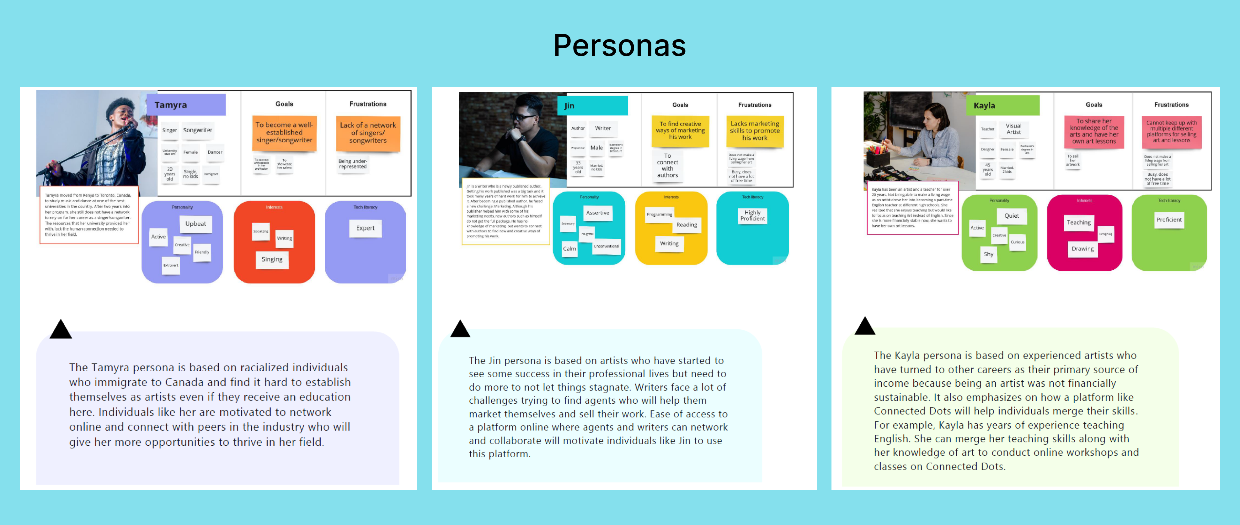
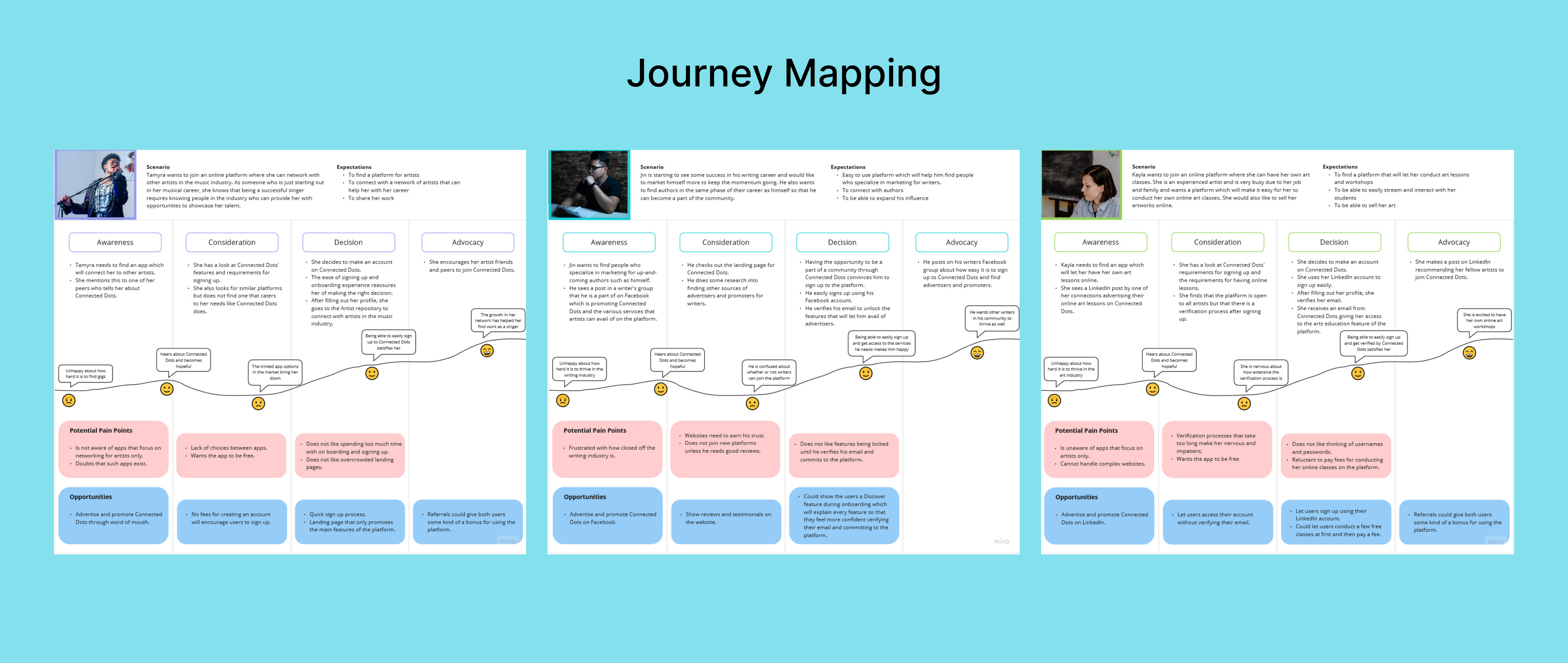
User interviews and surveys revealed 3 types of personas for us to focus on. We named them Tamyra, Jin and Kayla. Each of them are in different stages of their career and have different needs based on that as well as their lifestyle, kind of art they create, etc.
The journey
Building a path
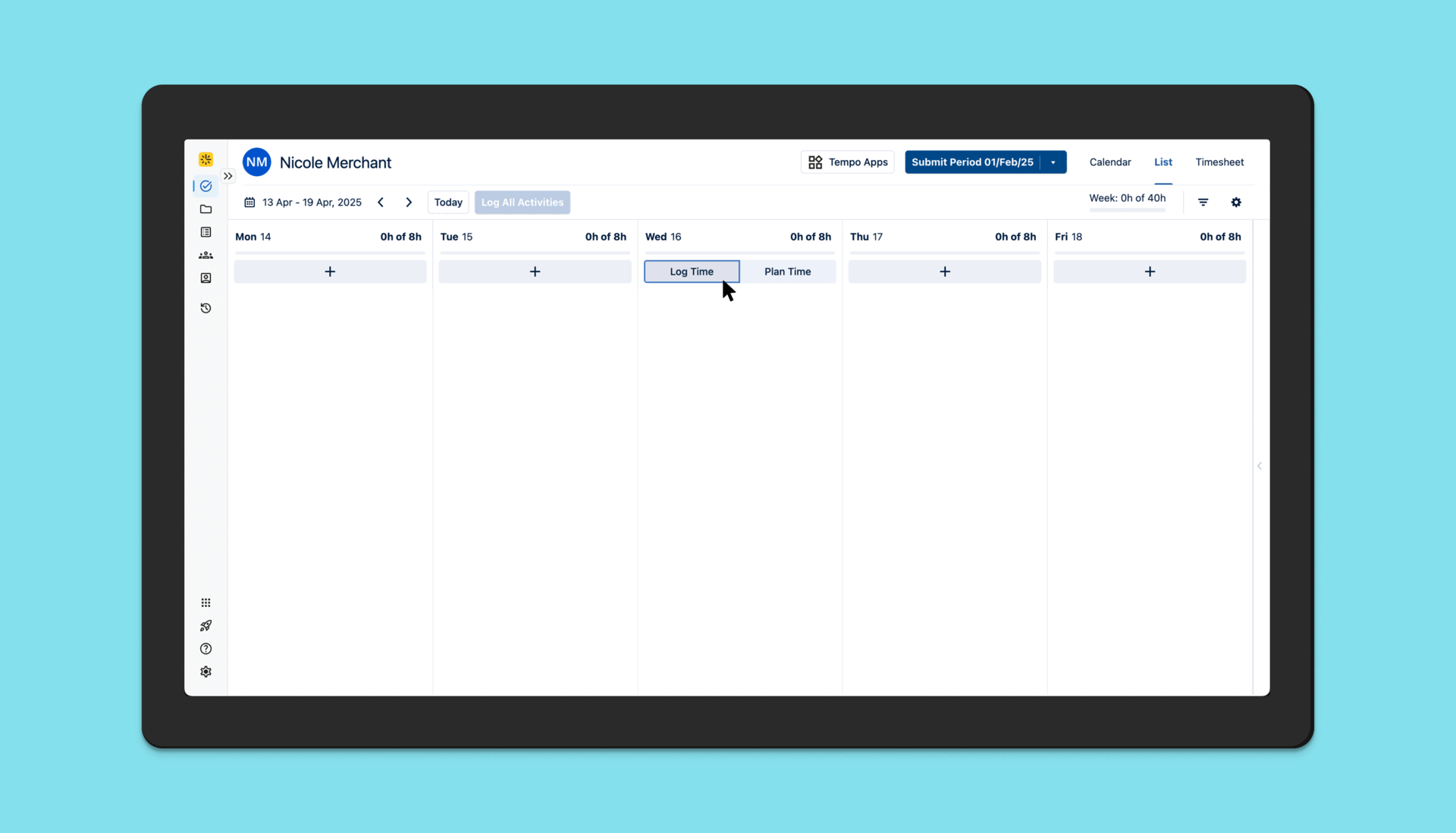
Objective: To determine if a single “Log All Activities” button for the entire work week improves user efficiency and satisfaction compared to daily buttons.
WCAG
Making the platform Accessible to all
Inclusivity was a cornerstone of the Connected Dots platform. During user interviews, we sought diverse perspectives, including feedback from a deaf individual who expressed interest in using the platform.
Key accessibility considerations included:
Visual Communication: Designed intuitive visual workflows that relied on clear icons, color contrast, and text alternatives, ensuring the platform was usable without auditory cues.
Text-based Features: Enabled seamless communication through text-based messaging systems and captions for all video content.
User Testing: Incorporated feedback from the interviewee to refine specific features, such as making notifications more prominent and introducing customizable visual alerts.
This focus on accessibility not only improved the platform for individuals with disabilities but also created a more user-friendly experience for everyone.
Prototype
Landing page and onboarding
Automation relieves the burden of time tracking for the end user and lets them focus on doing actual work. This increases productivity and saves the company money.
Cost savings: If an average Software Developer at a SaaS company that has 50 developers earns $200,000 and they spend an average of ~30 mins per week manually logging time, the company would save millions of dollars (9 million in this scenario) per year if the developers use automation to log time, which reduces time spent on the task to around 1-2 mins per week.
Teamwork
Cross-team collaboration
Bringing Connected Dots to life required close collaboration across multiple teams and disciplines. As the lead designer, I worked alongside:
Stakeholders: Collaborated with Tirgan’s leadership to define product goals and align the platform’s vision with organizational objectives.
UX Researcher: Partnered to conduct user interviews, synthesize findings, and create personas that informed the platform’s core features.
Developers: Engaged early to ensure the feasibility of the interactive prototype and iterated on designs to address technical constraints.
Grant Writers: Provided visual assets and clear descriptions of the platform’s functionality to strengthen the proposal for the million-dollar grant.
This collaborative process ensured that the final prototype was user-focused, technically viable, and compelling enough to secure significant funding.
success!!
Outcome
Connected Dots’ innovative approach to bridging communities earned it a $1 million grant from The Canada Council for the Arts. My contributions to this achievement included:
Creating a Compelling Prototype: Designed and developed an interactive prototype that showcased the platform’s core functionalities, helping stakeholders and grant evaluators visualize its potential impact.
Storytelling Through Design: Crafted user journey maps and personas that illustrated how the platform would empower individuals and foster connections.
Collaborative Pitching: Partnered with Tirgan’s leadership team to refine the pitch, ensuring the platform’s value proposition resonated with grant evaluators.
Winning the grant validated the project’s vision and demonstrated the impact of combining thoughtful design with strategic storytelling.
reflecting
Conclusion
Working on Connected Dots was an incredibly rewarding experience that combined creativity, collaboration, and user-centered design to tackle a meaningful challenge. By developing an interactive prototype that bridged diverse communities, we were able to secure a million-dollar grant, validating the potential of the platform and the impact of thoughtful design.
The Power of Collaboration: This project reinforced the importance of cross-functional teamwork. By aligning stakeholders, researchers, and developers around a shared vision, we were able to deliver a prototype that resonated with both users and decision-makers.
Accessibility as a Design Principle: Designing for accessibility, particularly incorporating feedback from a deaf user, taught me how inclusive design benefits all users and leads to a better overall product.
Iterating on Feedback: The user interviews provided invaluable insights into real-world challenges, underscoring the value of listening to your audience and iterating based on their needs.
Resilience in Uncertainty: While I didn’t continue contributing to the project after the grant was secured, I gained valuable experience in navigating ambiguity and setting a strong foundation for others to build upon.
Connected Dots exemplified how design can drive social impact, and it remains a proud example of how user-focused design, strategic storytelling, and collaboration can bring innovative ideas to life. This project not only strengthened my skills but also reaffirmed my commitment to creating products that empower people and solve meaningful problems.
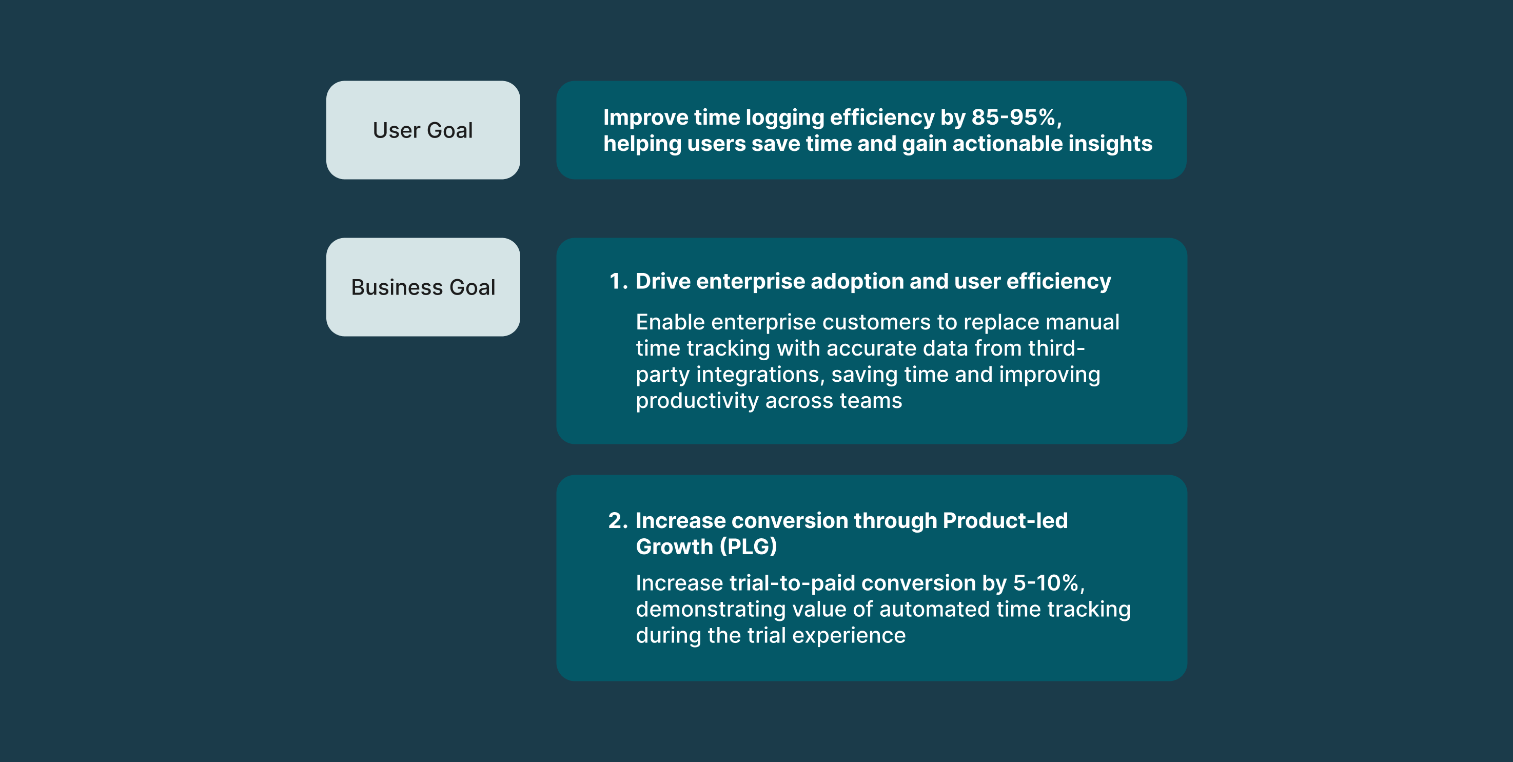
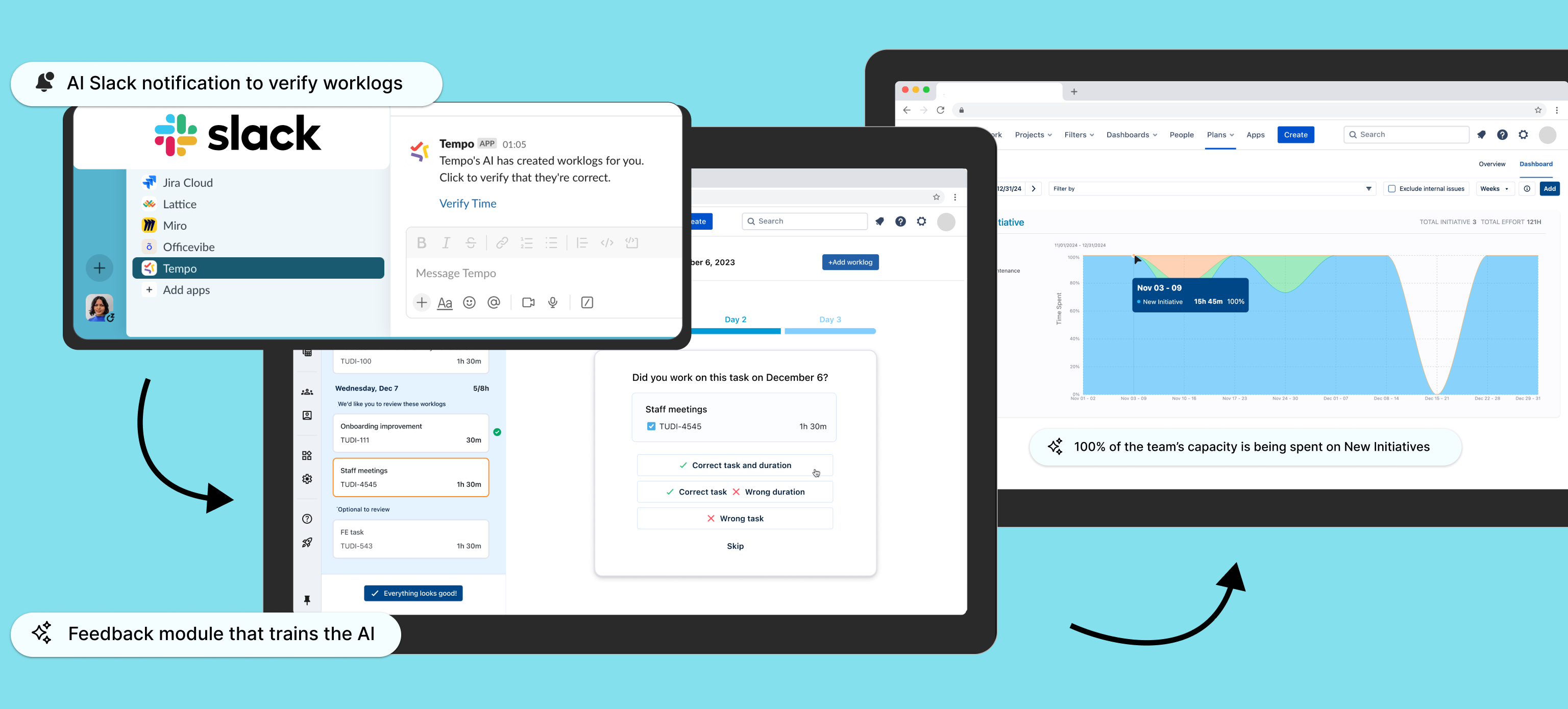
Problem Enterprise users hate logging time manually because it’s time-consuming, leading to low task efficiency and user drop-off.
Opportunity: To reimagine time tracking as a low-effort, high-accuracy experience by combining user-controlled automation with ML. By leveraging data from different systems, we could reduce manual input, improve data reliability, and rebuild trust —while meeting the needs of both individual users and enterprise administrators. This would help Tempo expand in the Enterprise space.
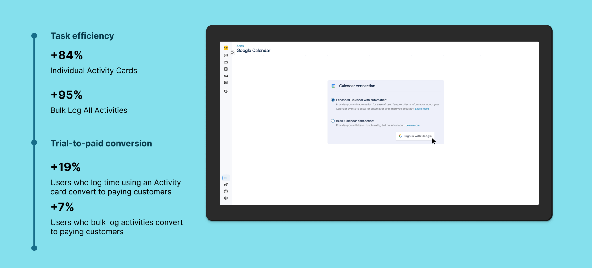
My Role: I led end-to-end design for Tempo’s automated time tracking feature. Interviews with enterprise users revealed that they were frustrated with spending 30+ mins a week manually logging time. This created an opportunity for a UX strategy that would reduce user pain through automated time tracking. I pushed to introduce bulk logging activities, org-level integrations, and improving our ML algo to recognize common patterns, making time tracking faster and smarter at scale (among other things).
How might we use integrations for automated time tracking to reduce user friction, increase efficiency and increase trial-to-paid conversion?
🎯Objectives
Discovery & Research
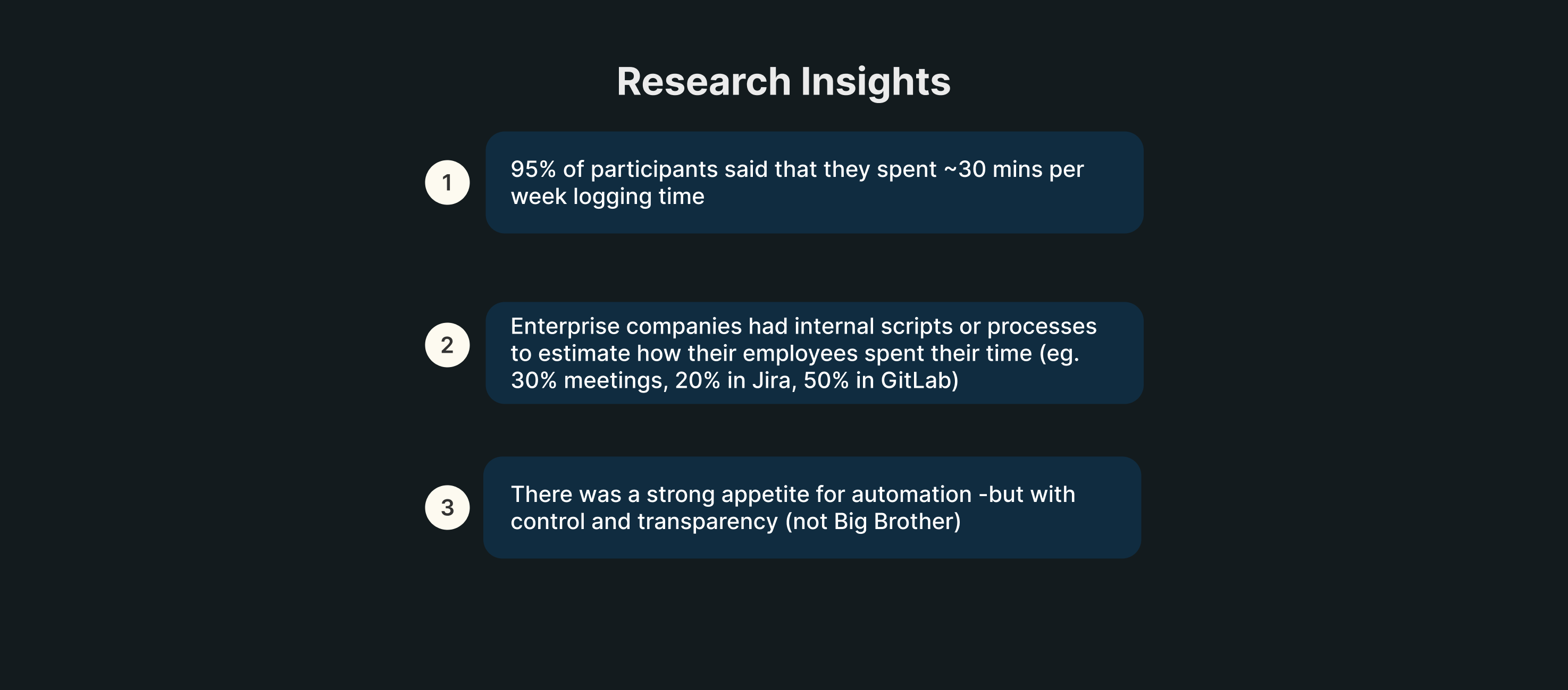
To identify opportunities to improve task efficiency for enterprise users, we conducted user interviews with them. After a combination of user interviews, insights from our Atlassian solutions partners, requests from our Aha! Idea portal, Amplitude data and surveys, we got the following insights:
Quotes
“Copying all my meetings into Tempo every week is like pulling my teeth out. Please build an O365 integration for my Outlook calendar.”
“It would make a huge difference to our user base if Tempo could be integrated with our O365 Calendars and have worklogs automatically created.”
“A GitLab integration will be very useful for our engineers so that they can spend less time logging their work.”
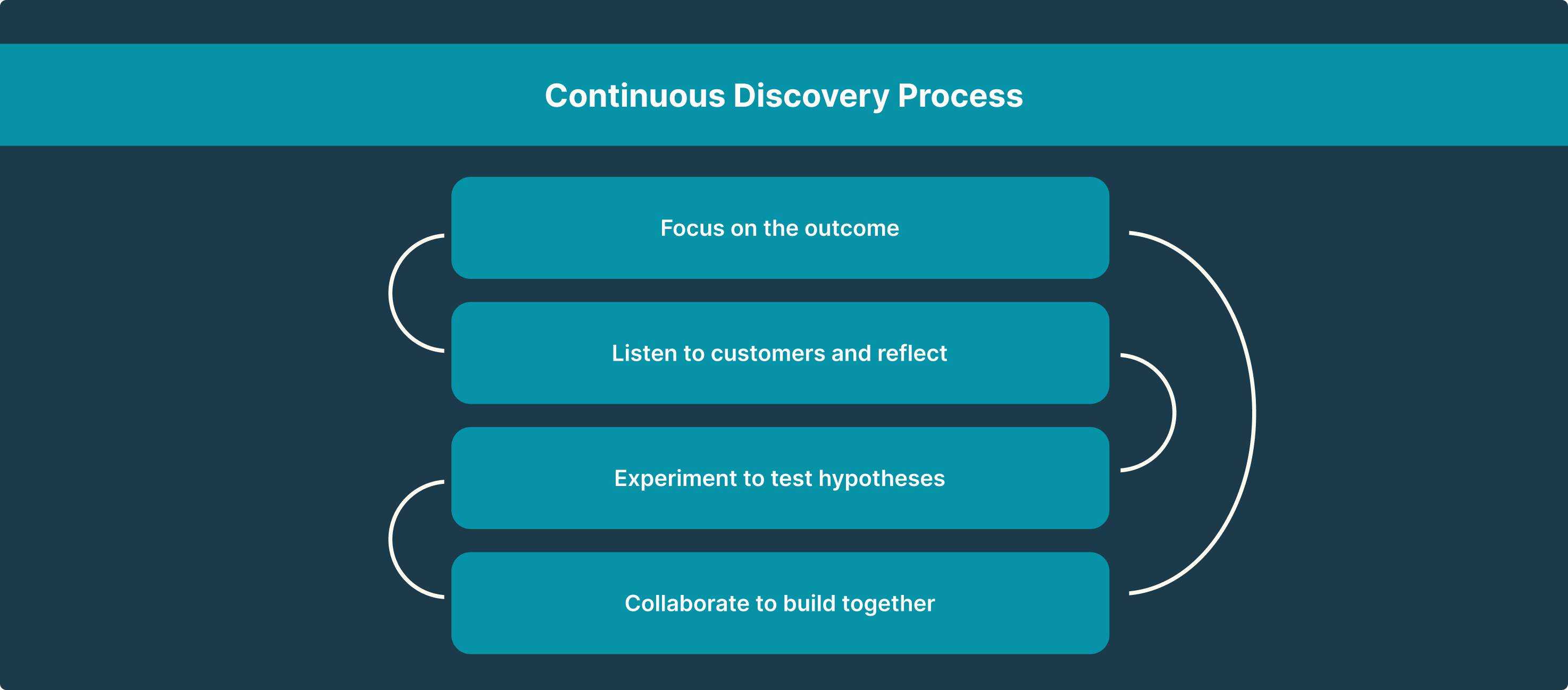
My process is a combination of Lean UX (Think->Make->Check, repeat) and the Continuous Discovery Process, in a SAFe-ish framework.
Ideation & Collaboration
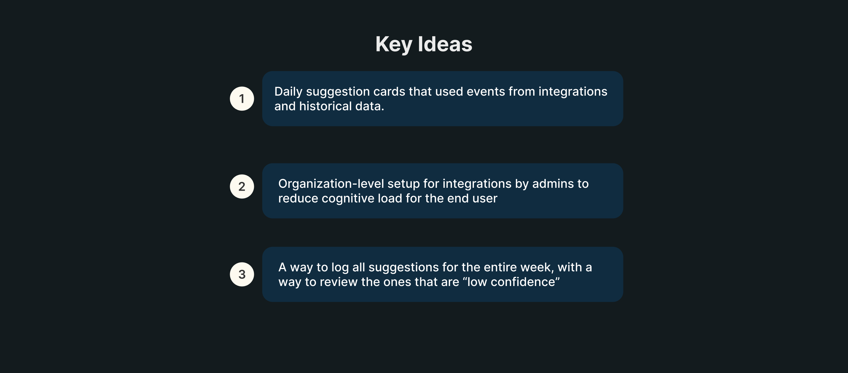
I collaborated with our Machine Learning team to understand the ML model’s potential. Here are some things I pushed for:
Identifying key words and associating them with Jira tickets so that users don’t have to spend time linking each task to a Jira ticket
Picking the activity (suggestion) that the ML model is most confident about based on signals from different systems
Transparency into the signal sources so that users are aware of what data is being used
Things I influenced while collaborating with my PMs and engineers:
Product Led-Growth (PLG) strategy for enterprise
Using automation to reduce load on the user
Technical feasibility of bulk logging all activities
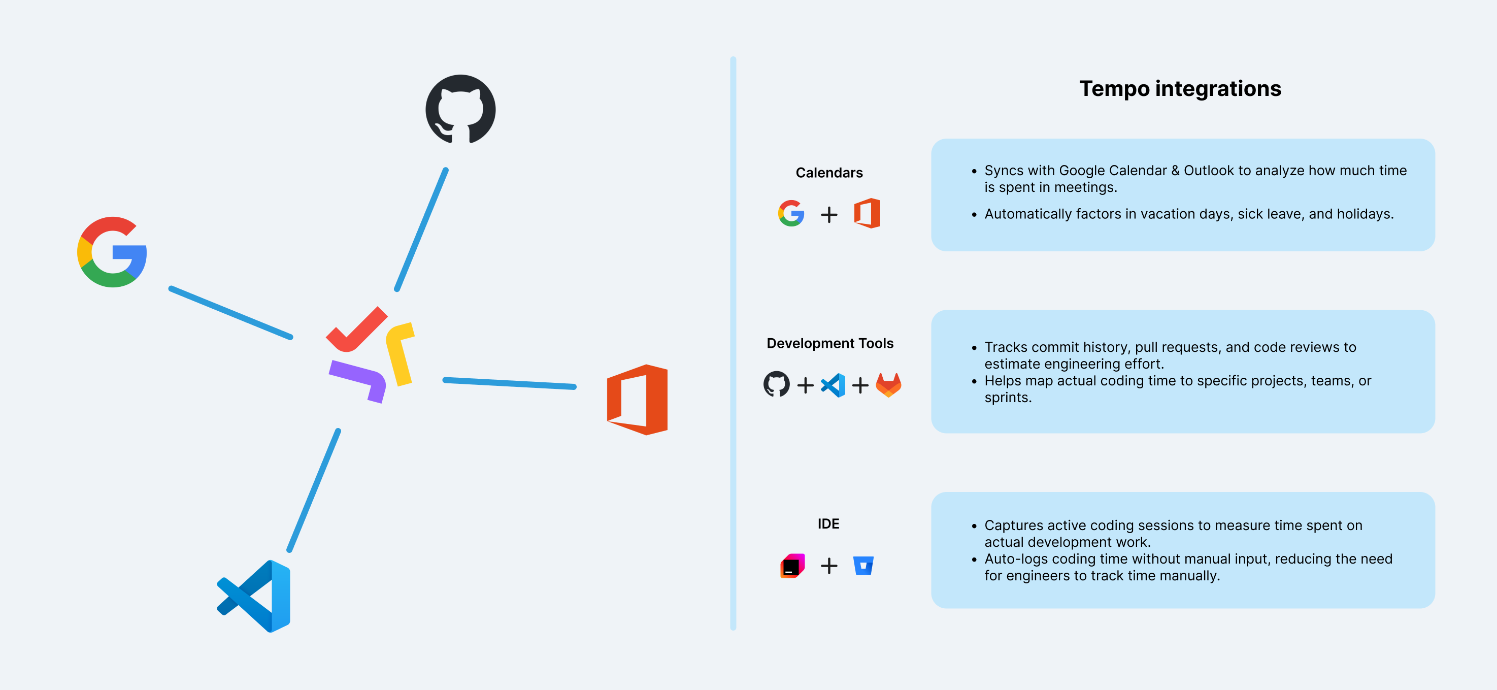
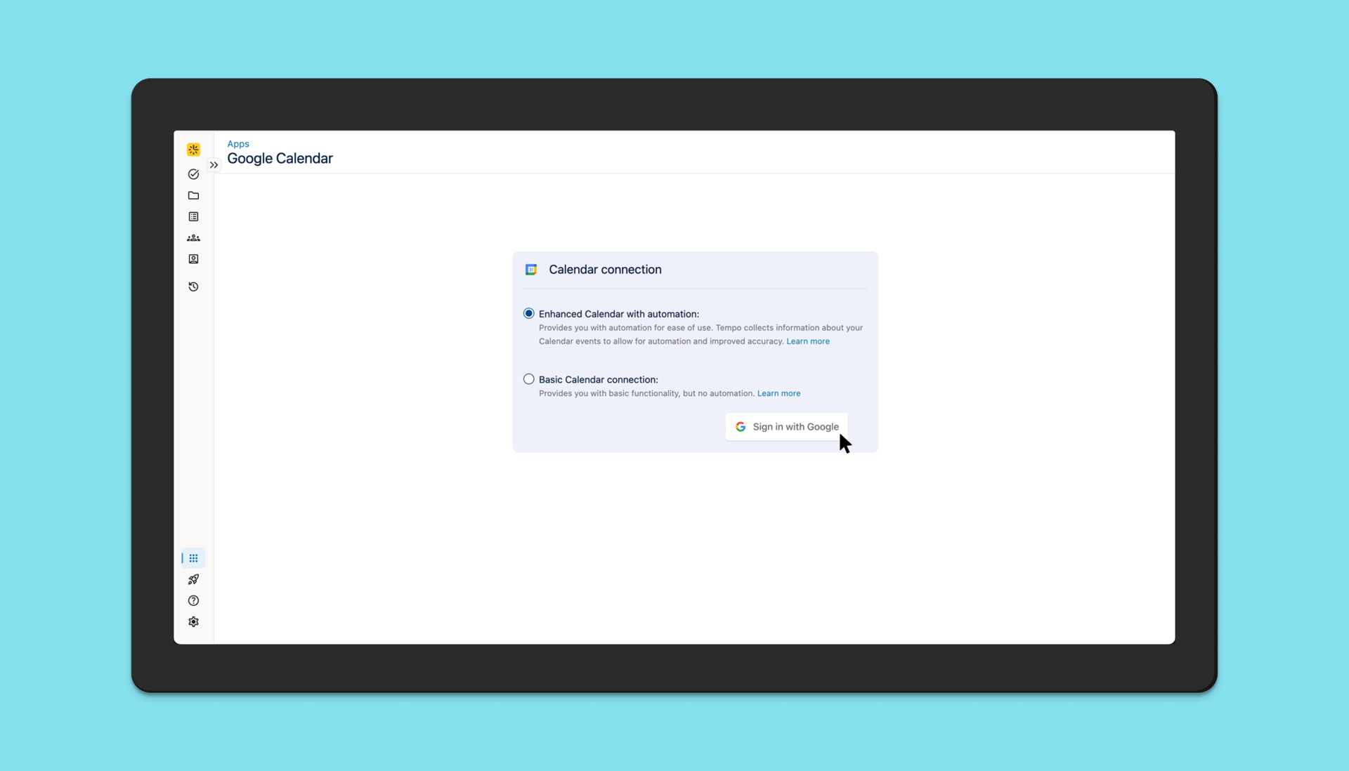
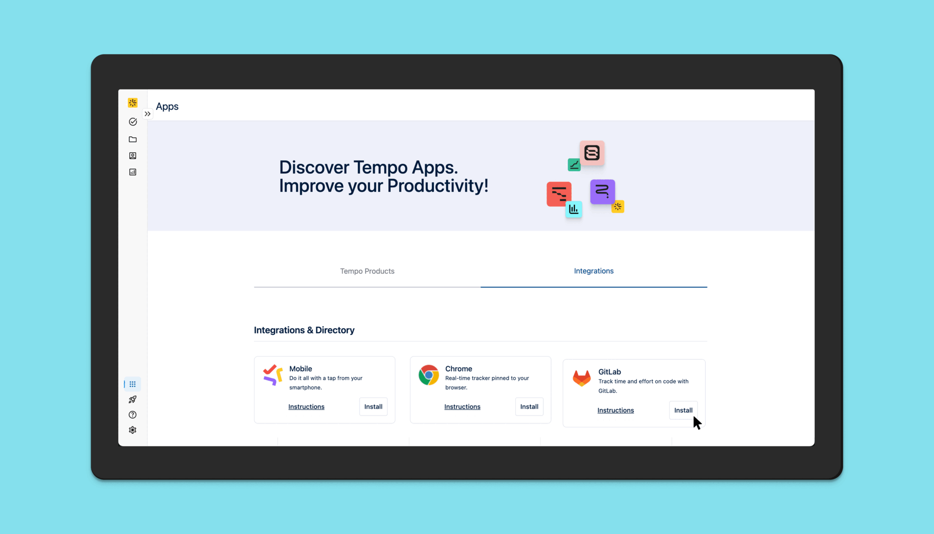
Employees use a lot of different products to do their jobs and to give them an accurate depiction of their workday, we have to consider getting the data from the apps that they use the most. Timesheets by Tempo’s integrations help users get a better picture of the work they did thanks to integrations with Google Calendar, Office 3655, Github and VS Code (to name a few).
In order to tackle a major pain point that was identified from enterprise customers, we released organization-level integrations, where an admin can enable integrations for the entire organization or specific Tempo Teams that they choose.
This reduced the burden for individual contributors as they no longer have to manually go in and enable each integration in their instance.
User interviews revealed a fear of being tracked by AI and how this information could be misused by various entities. We actively educate our customers on how time tracking data should not be used to measure performance or worse, to shame employees. Our messaging is always about how time tracking should be used for R&D credits, for measuring team health and productivity to prevent burnout, etc.
Apart from the messaging and educational aspect, we also have certain considerations for security built into our systems. For example, for Github, the app captures events from Github’s webhooks for Create, Push, Commit and Pull Requests, and does not read actual code.
Third-party integrations
Individual-level integration set up
For the first iteration, we did qualitative and quantitative testing for end users setting up integrations and logging activities for a single day.
Organization-level integration set up
For the second iteration, we introduced organization level integration set up to reduce cognitive load for the end user and increase their time to value. Their admin would do a one-time setup for each integration for their entire organization and end users would be able to start using AI Activity cards immediately.
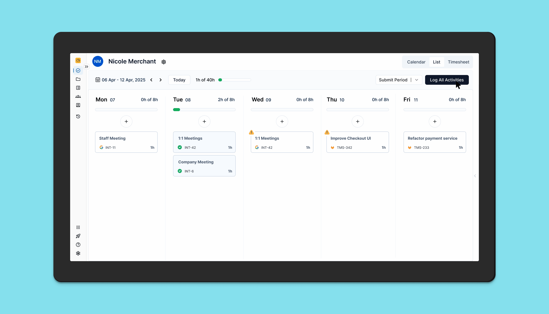
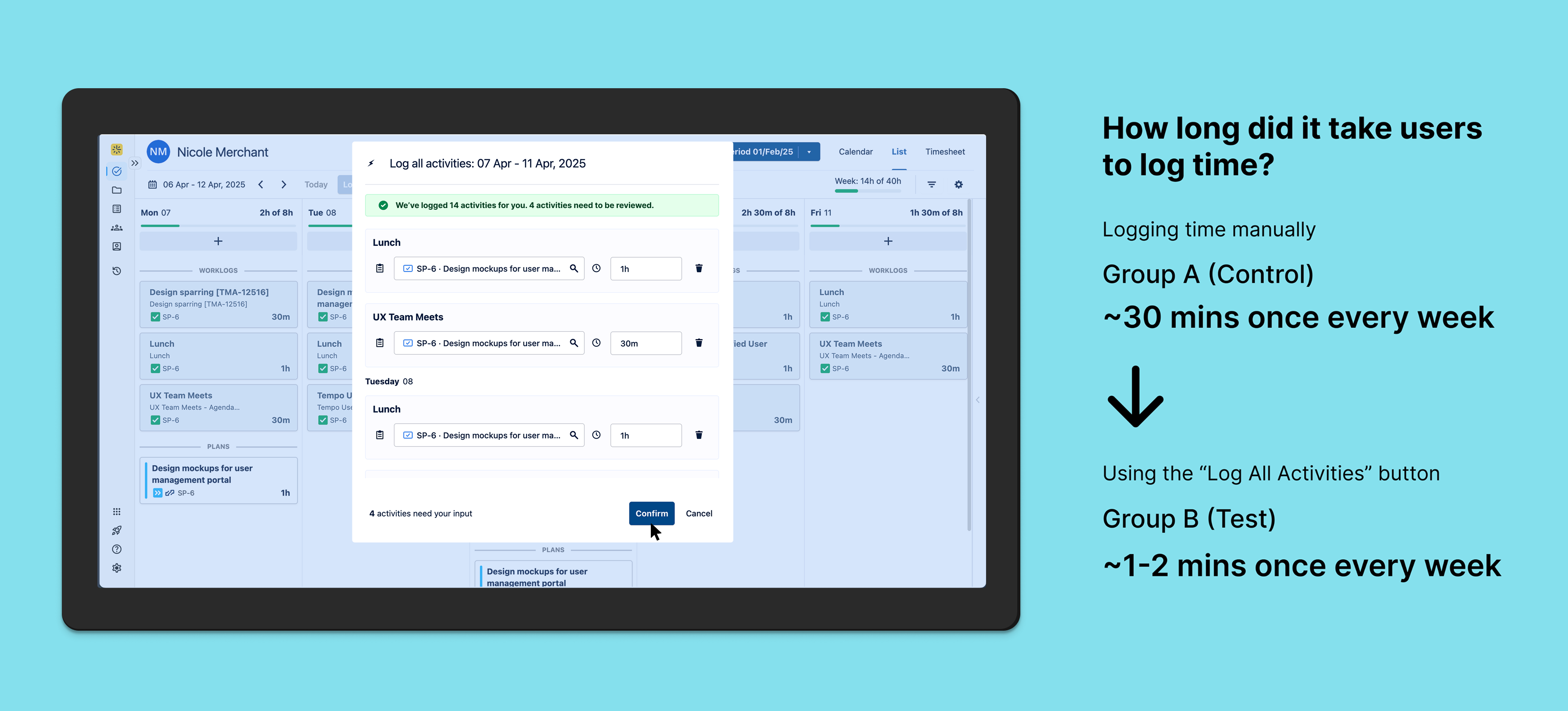
After this, we introduced Bulk Log All Activities for the entire week in order to make logging time even more efficient for end users.
Usability Testing for “Bulk Log All Activities”
Objective: Ask users to log all activities and determine whether they can easily find and use the button.
Hypothesis: Placing the “Log All Activities” button at the top of the page will result in a higher success rate and faster task completion time for users when they attempt to log all activities, as it aligns with their expectations for accessing primary actions quickly and intuitively.
A/B Testing
Objective: To determine if a single “Log All Activities” button for the entire work week improves user efficiency and satisfaction compared to manually logging time.
Hypothesis: Users who have access to a single “Log All Activities” button for the entire work week will find it more efficient and will log their activities more consistently compared to those who have to manually enter each activity.
Impact Metrics: 1. Time spent logging activities 2. User engagement rate (how often are they logging time?)
The Test: Group A (Control) will use the existing manual log time flow, Group B (Test) will have a new “Log All Activities” button for the entire week. The Data and Analytics team collected data for the metrics mentioned above and we ran the test for 6 weeks.
Group A
Group B
outcome & learnings
Increased workflow efficiency
Automation relieves the burden of time tracking for the end user and lets them focus on doing actual work. This increases productivity and saves the company money.
Cost savings: If an average Software Developer at a SaaS company that has 50 developers earns $200,000 and they spend an average of ~30 mins per week manually logging time, the company would save millions of dollars (9 million in this scenario) per year if the developers use automation to log time, which reduces time spent on the task to around 1-2 mins per week.
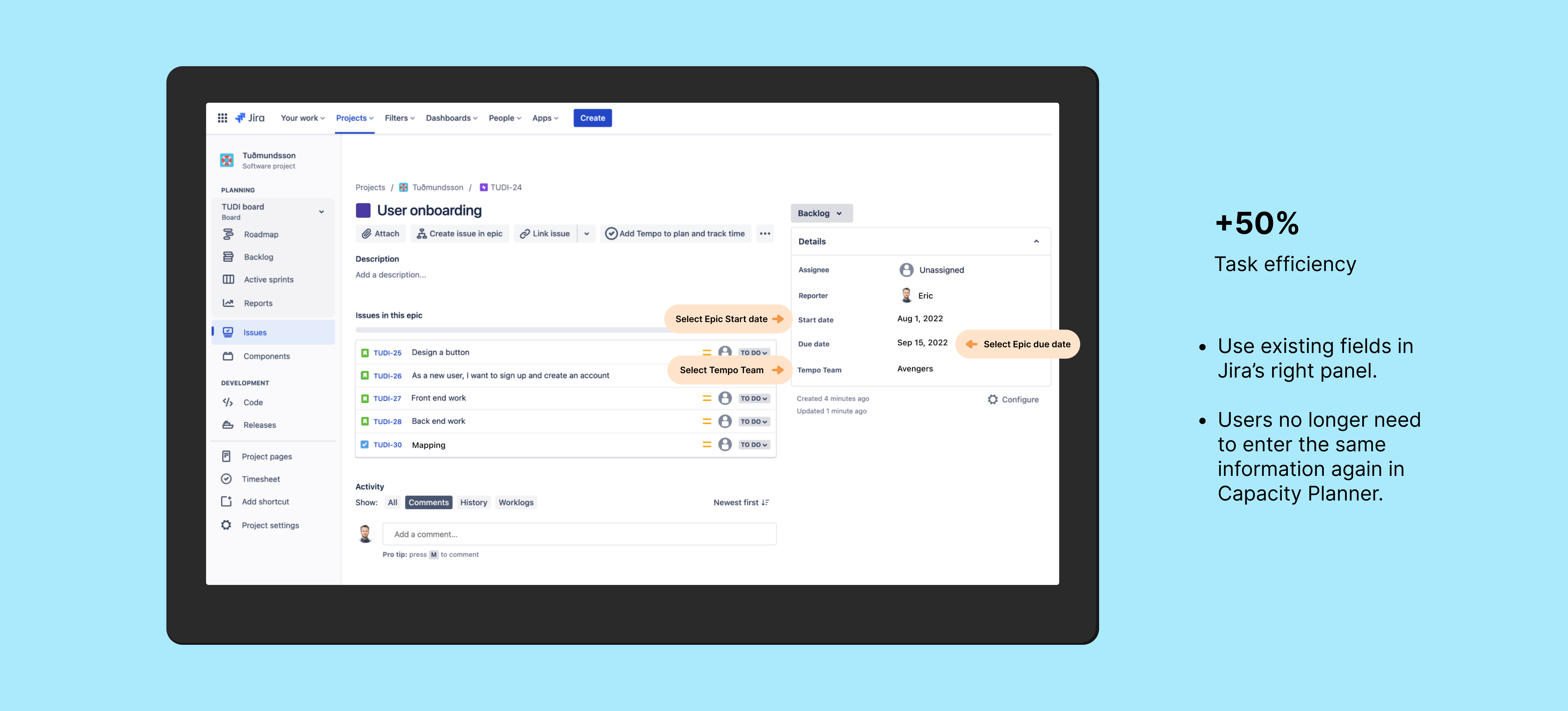
This feature is performing at a trial-to-paid conversion rate of 19%. This helped me identify a PLG opportunity for introducing this feature in the Tempo panel in Jira’s issue view which is used by 49% of our users. These users never navigate to the main product, hindering their discovery of AI generated suggestions.
🔮 Future vision
keep on talking to customers 💬
Discovery never ends
Working on automation and integrations opened new avenues of design thinking for me. After this initiative, we started discovery on whether AI can log time for users and generate insights for their managers about the work that their team has been doing. This led to the launch of a new product in the Atlassian marketplace called Capacity Insights.
How might we improve alignment between teams and SLTs so that resource allocation is optimized and goals are accomplished in a timely manner?
Overview
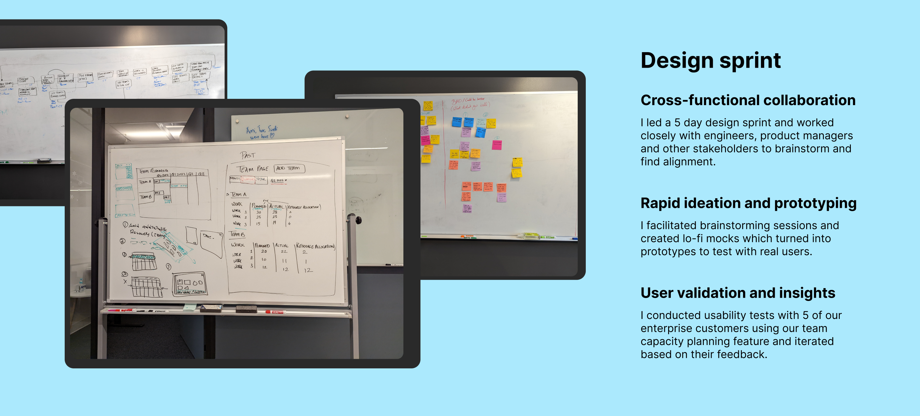
This initiative started as a 0-1 product that was supposed to launch in the Atlassian Marketplace. I spearheaded a design sprint in Montreal where my team and I spent 5 days identifying and aligning on the problem we were trying to solve. After talking to partners and customers, however, it was decided to release this as a feature in the existing Capacity Planner product.
cross-sell
Collaboration with Growth
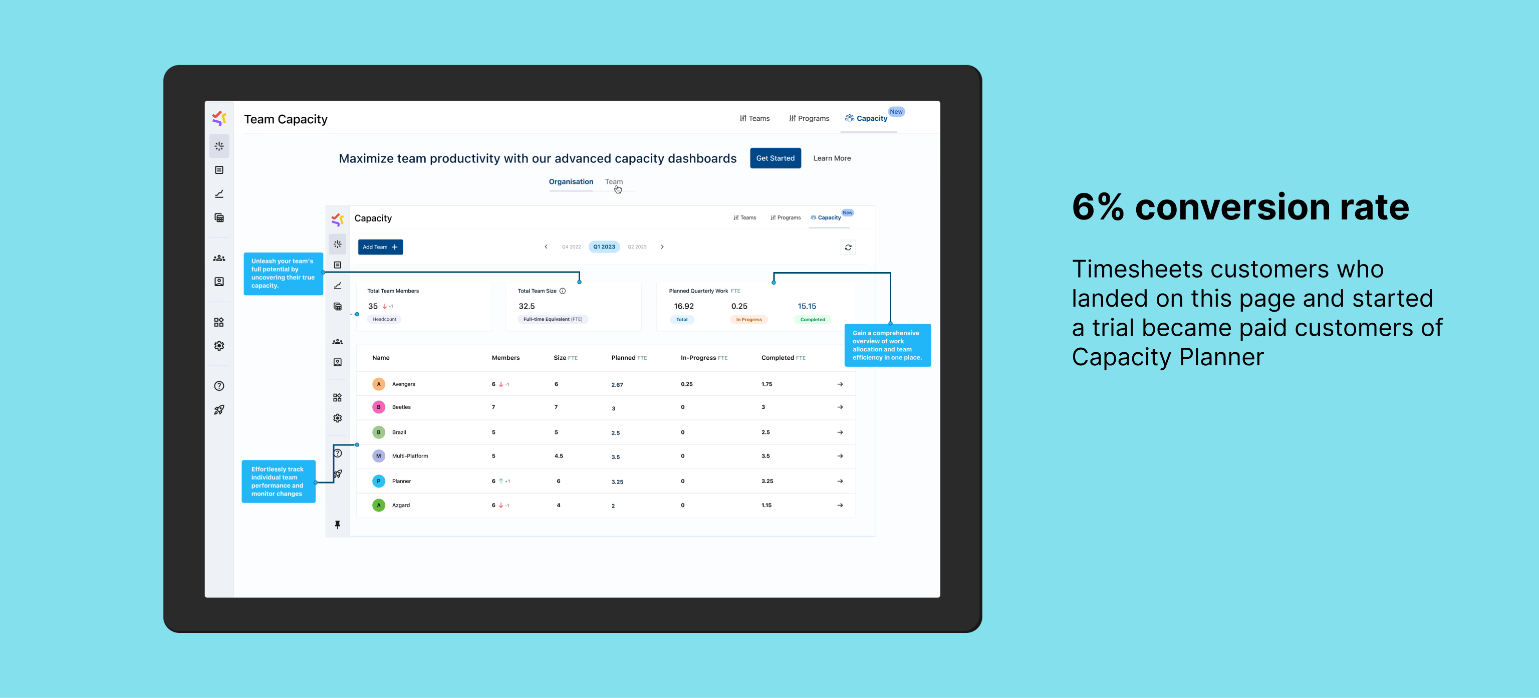
I worked closely with the Growth team to come up with a strategy to cross-sell Capacity Planner to Timesheets customers.
Only 20% of Timesheets customers use Capacity Planner and we identified an opportunity to surface Capacity Planner in the navbar for customers with Timesheets so that they can discover and learn about the product. This could lead to new trials and an increase in revenue if the product meets their use cases
The Capacity Planner page highlights all of the major use cases that would benefit mid-sized and enterprise customers in particular. We worked closely with Sales to identify these.
Make it simple
Maximizing Efficiency using Automation
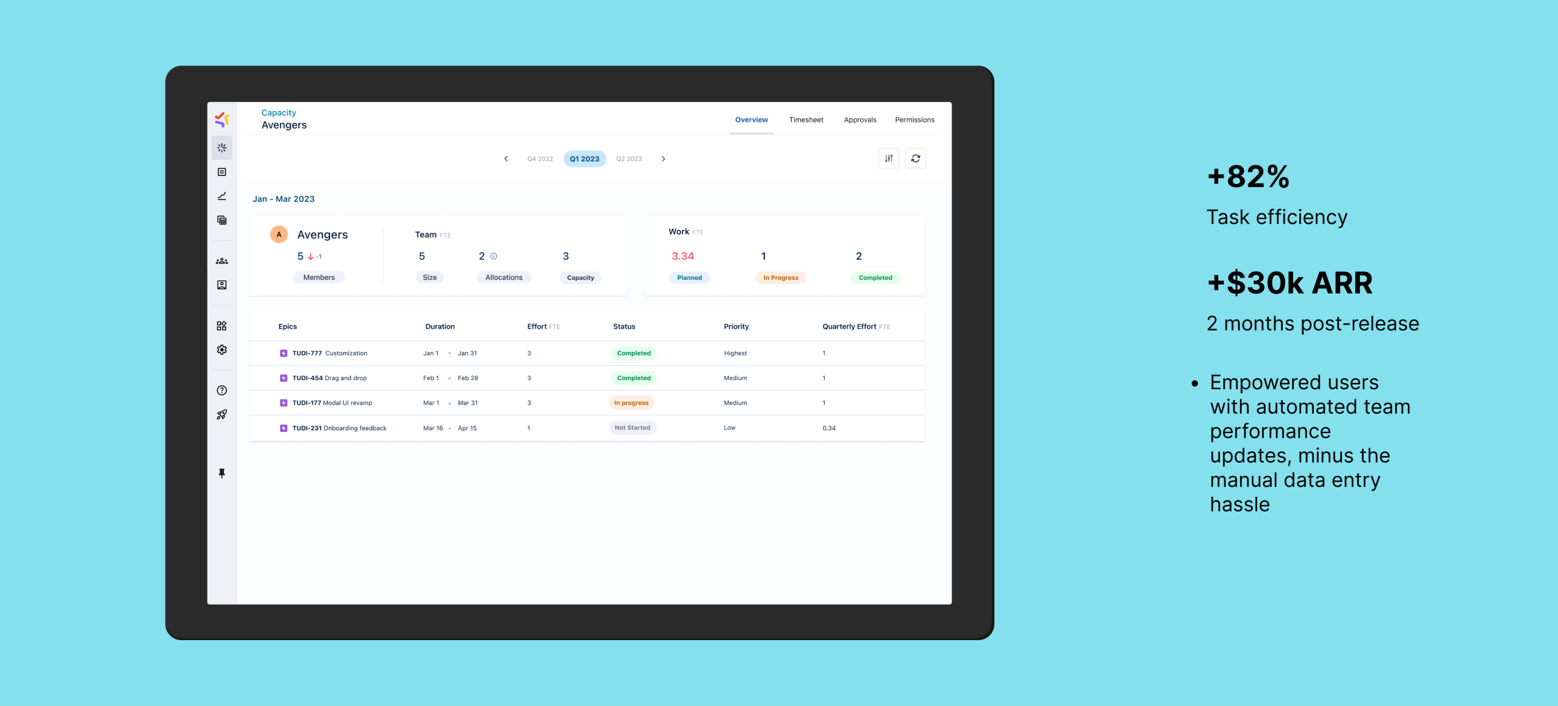
The Team Capacity Dashboard utilizes Jira original estimates with Planner by Tempo’s workload and holiday schemes to calculate team capacity efficiently. As a team manager, this helps in monitoring bandwidth across multiple teams, facilitating resource allocation and identifying potential over or under-allocation issues. The Team Capacity Dashboard offers insight into team size, work distribution, and progress. It showcases planned and available time in FTE, aiding in informed decisions regarding hiring needs and resource adjustments among teams.
This helps Product and Portfolio managers plan at a higher level by taking into account past and present team capacity information. The dashboard seamlessly integrates with the Team Planning feature in Planner by Tempo.
Make customers love you
Observe, listen and learn
Talking to customers led to many discoveries about what they were looking for in their planning process. We heavily leaned into automation because folks hate planning and wanted us to leverage information that is already available through different sources to paint a picture for them that would quickly give them valuable insights.
Giving them information in FTE also meant that they could leverage this information for their budgeting and finance purposes. This made the dashboard stand out from our competitors.
Learnings
Outcome and Reflections
Increase in net new customers The cross-sell page is currently performing at a conversion rate of 6% from trial-to-paid.
Timeboxing It was my first time running a design sprint and I learned the importance of timeboxing. It was hard to stay on schedule because of how much energy everyone was putting into the brainstorming sessions, which led to us having to adapt to complete all of the tasks that we wanted to.
How might we streamline planning for teams by making the planning process more efficient by using automation, upgrading legacy features to pave a new path forward?
Optimizing teams for success
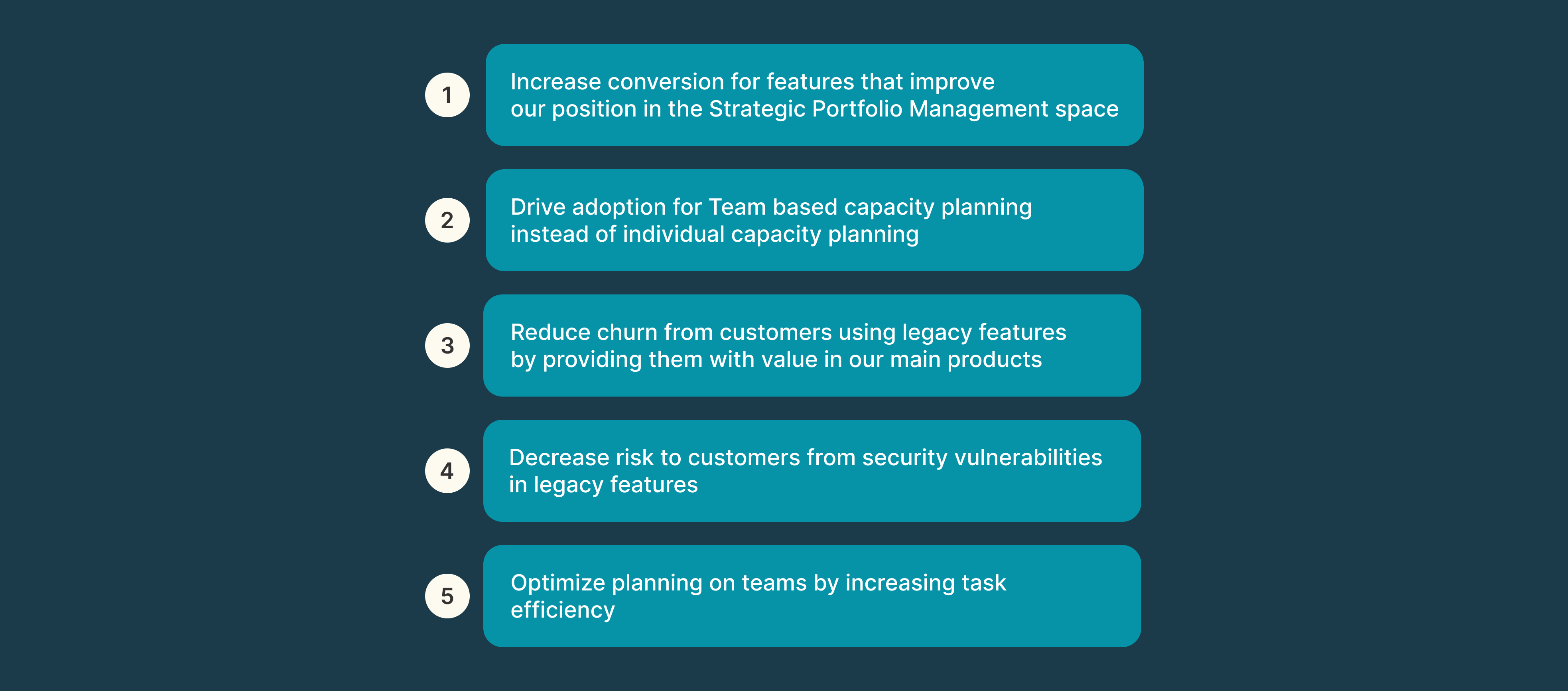
Planner by Tempo’s focus had been to enable planning on individual employees for the longest time. Strategically, the company was moving into the Strategic Portfolio Management space. We were also planning on shifting our focus from Agencies to Software development companies. This meant making our product more Agile focused and thinking of teams/tribes/squads instead of individuals.
Customers love our Teams feature and we had a lot of feedback for integrating it with other features to give them more value. We have a seamless exchange of information between this feature and the Team Capacity Dashboard.
not reinventing the wheel
Efficiently utilizing existing systems
Getting to the final solution involved going through a lot of iterations. Since we had a legacy feature that had to be deprecated, I collaborated closely with leadership as well as our engineering, customer success, and marketing teams to decide on the best possible way to bring this solution to life. This involved me following the product design process to brainstorm and ideate on what would bring the most value for our customers. I pushed for changes that would make this feature more useful while also aligning with our business strategy of moving into the Strategic Portfolio Management space.
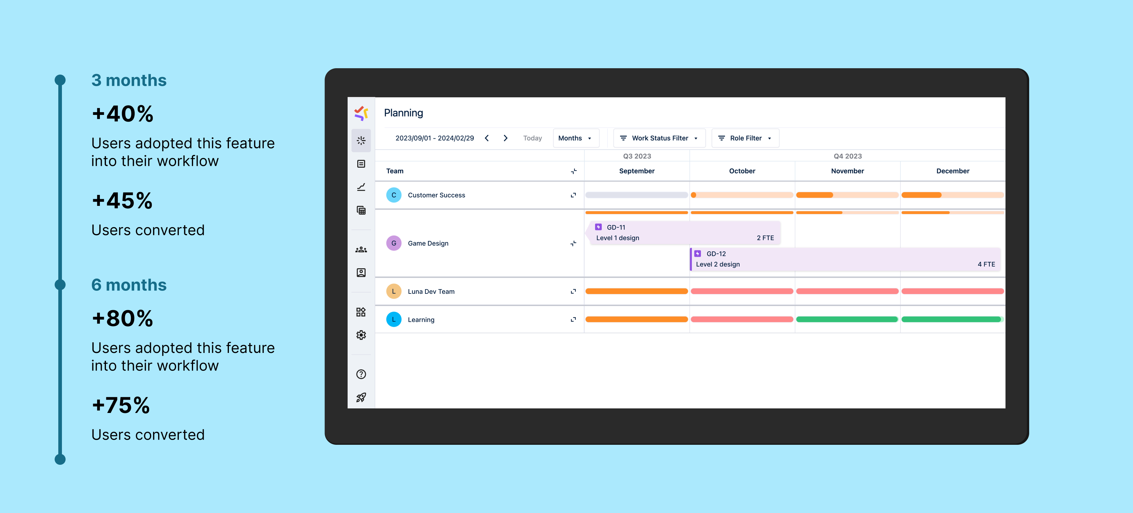
We identified what customers loved about the legacy feature and identified opportunities to go beyond. Existing in the Atlassian ecosystem gives us access to existing systems in place, like planning on Epics, using the Original Estimate field to calculate level of effort, etc. For the initial release we decided to utilize these processes to our advantage, which drove adoption, user conversion and task efficiency for the feature.
WHEN legacy becomes dangerous…
Keep shielding customers to keep their trust
My teammates over at the engineering department identified code in the legacy Team Planning feature that was a threat to customer safety. This was not just a threat to our customers using the legacy feature, but to ALL of our customers, our codebase as well as the reliability of our software. I collaborated with them to pave a path forward by identifying the top priorities for enterprise customers and focusing our design and development efforts on that.
Breathe a sigh of relief when risk goes down
I worked closely with my engineering peers to quickly identify which solutions brought the most value to our customers and had to be made available to our them immediately. This in turn would let us nuke the legacy feature as soon as possible.
listen and reflect
Saying “Please stay” doesn’t work on customers
We talked to enterprise customers to recognize opportunities for better integrating our product into their planning workflow. One of the major features that we implemented that led to customer retention was automatically converting Jira’s Original Estimate field on epics to Full-time equivalent (FTE). Full-time equivalent is a unit to measure effort and capacity.
Talking to enterprise customers gave us this Aha moment of converting estimated hours from Jira epics to FTE so that Product/Project Managers could match that to the team’s capacity in FTE (which Planner already provides). This helped customers find even more value in the new Team Planning workflow by tying it to Capacity Planning and led to higher retention.
All’s well that ends we- wait
Never stop learning
One of my main goals while working on this feature was to use the product design process to drive innovation in collaboration with Product Management, Engineering and Customer Success. Interacting with enterprise customers to understand their needs and frustrations helped us align on what we needed to build. I also enjoyed engaging with leadership and contributing to our overall product strategy. There were a lot of moving pieces which made things difficult, but finding the path forward as a team is very rewarding.
This initiative really drove home how talking to our customers, iterating quickly and delivering value continuously leads to success.